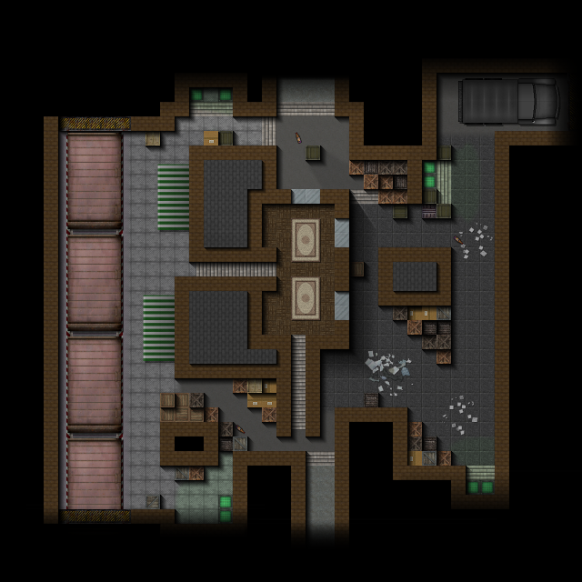
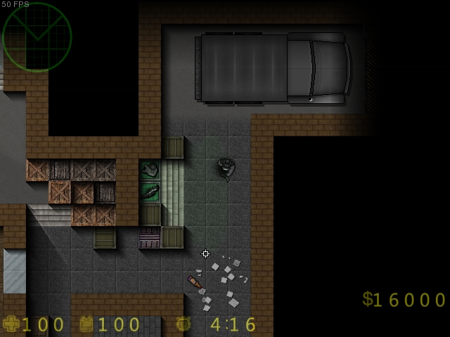
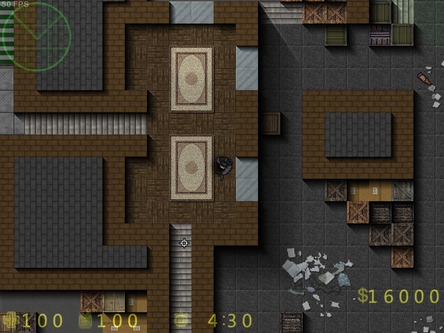
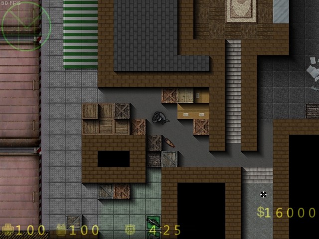
Dateien

> > CS2D > Maps > awp_grey_rem
DateiübersichtCS2D-ÜbersichtMaps-Übersicht

Englisch awp_grey_rem >

20 Kommentare490 kb, 474 Downloads

alt awp_grey_rem

zazz
User Off Offline

Hello guys, this is a remake of the famous awp_grey!

∗ Credits:
• Yates; Some tiles
• Guitorres; Carpet sprite, Train sprite, Train tiles.
• Alistaire; Shadows.
• Useigor; Truck sprite.

If i forgot someone, let me know so i add him here
Zugelassen von Leiche

Download Download

490 kb, 474 Downloads

Kommentare

20 Kommentare
Zum Anfang Vorherige 1 Nächste Zum Anfang

Logge dich ein!

Du musst dich einloggen, um selber Kommentare verfassen zu können!Einloggen

alt

4verNinja
User Off Offline

Beautiful map looks pretty good and there is quite a bit of mobility
Ich mag es!

alt

zazz
User Off Offline

@user Time: lmao, Thanks.
@user Nekomata: Very nice tips, i'll use them, cheers!
@user Jite: It's just a remake of the original awp_grey!
@user Masea: Alright!
@user Yates: Np, Alright, thanks!

alt

Pagyra
User Off Offline

It is very good... but i think it is good idea if you try to improve wall tiles, fix shadows of car, wagons and walls.
Mb you try to use light engine for map and add some room and lights entities.
Ich mag es!

alt

lelu
User Off Offline

bad bad bad as always afff
Ich mag es!

alt

Yates
Reviewer Off Offline

Credits hat geschrieben
• Yates; Some tiles

Nice, I helped out √

Looks great, nice remake. Although Time is right about the space but in this case a remake really cannot change that a lot without losing it's value as a remake.
Ich mag es!

alt

Time
User Off Offline

@user Cure Pikachu: Felt like I've seen this somewhere. Even so, my point still stands. But it would not be right to rate anything else than what he's worked on. So if it's only the visuals we're talking about this is worth a like.

Thanks for pointing it out, I can't be bothered to read descriptions because I'm an idiot.
Ich mag es!

alt

Cure Pikachu
User Off Offline

@user Time: Can't blame him for the layout, it is a remake (file cs2d awp_grey ) after all.
Of course, I think you should credit user Banaan for the original map, esp. the layout, otherwise this decent remake wouldn't exist.
Ich mag es!

alt

Time
User Off Offline

The map looks neat, but the layout is rather bad.

There are loads of one tile wide passages which are absolutely terrible from a gameplay perspective. I understand the cramped urban feel you were trying to go with but anything more than one or two short non essential one tile passages is excessive.

The fact that this is an awp map makes the one tile corridors even worse and mostly unusable death traps.

I appreciate your sense for aesthetics though, for the most part.
Ich mag es!

alt

Nekomata
User Off Offline

I like how you're adding your own shadow sprites. There are some shadow-mapping errors however. I see that you've added a shadow on some boxes to make them look as if they're on top of each other however the stacked one's shadows are a bit wrongly mapped.
If it's facing the ground then the shadow should be a bit longer on the floor, not the same as the other box it's "stacked" upon.

Other than that, since you're stacking boxes. Here's a really simple tip. There's a tile darken option in the map editor. So if you "stack" boxes. Remember to dark the first layer of boxes slightly so the highest box is the brightest. Remember to keep this consistent throughout the map.

Nevertheless, the map looks nice.
Ich mag es!

alt

Artwolf
User Off Offline

Wow~Nice map.('o')
Ich mag es!

alt

Mami Tomoe
User Off Offline

nice!
Ich mag es!

alt

Gaios
Reviewer Off Offline

Nice shadows
Ich mag es!

alt

THEMUD
User Off Offline

Good job! It's an awesome map!
Ich mag es!

alt

Jite
User Off Offline

At some points it looks quite well, but i must say that a at the east and west side aren't many possibilities for hiding like AWP player do.

alt

EpicBaron
User Off Offline

0/10,havent seen worst.


Jk good jobd mate
(si soy epic pelotudo)
Ich mag es!

alt

Masea
Super User Off Offline

user zazz, Use little bit big shadows for that. Be sure, It will be more nice, when you did what I said.
Ich mag es!

alt

Cebra
User Off Offline

looks really good
Ich mag es!

alt

zazz
User Off Offline

Thanks for liking it, i used the big shadows because it's a building/apartament, and the small shadows because it's like a small roof near it.

alt

Talented Doge
User Off Offline

Now it looks a lot better.
Ich mag es!

alt

Masea
Super User Off Offline


Wow, new design for the awp map, what I need to see. But I have little question(First, open spoiler); Why you didn't use the same shadow(red place), for the blue places?

Anyways, it is still good.
Ich mag es!
Zum Anfang Vorherige 1 Nächste Zum Anfang