You guys know that there is a naruto 2d lua script on FPSbanana right? >> im assuming this was made for it. I could care less about weather or not a menu pic is re sized >>
the only thing in my opinion that he should have added to make it more functional is a black rectangle under all the menu options to make them more visible.
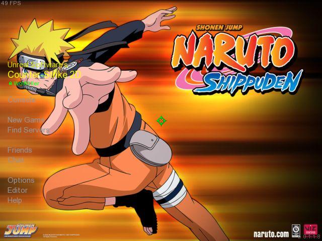
Well, Inverting the image would make it look worse, unless you mean inverting the menu part, making it separated from the pic part, and darkening the menu part a bit. Like in my splashes.
If you meant it like that, then that's what I meant, although it's much easier to only darken it a little bit more.
Or, did you mean, FLIP the image? Like... Naruto would be on the second side?
Yeah, that's another solution, but it would be easier to find a new pic, and he wouldn't have to worry about the logo.
Well, that's only my opinion.
I hate Naruto and, possibly, narutards.
But let's ignore that. I will rate fair.
It actually looks kinda normal, but is too bright on the menu side, I would make it darker there, but, then again, your Naruto would be kinda... Invisible.
So yeah, who is using a custom font, shuold be okay, other than that, the menu will be hard to read and stuff.
I would find another pic to use, with the character on the right side, along with the logo if you want, and make a part of the left side a bit darker, so the menu is easy to see.
After that, it should be visible.
So yeah, rating it "It's Okay"
Because of the fact it's too bright on the menu part.
Other than that, Naruto fans will like this, I guess.
 Offline
 Download
 Naruto(Splash)
  8 like it!601 kb, 842 Downloads
 4/5
4/5 
 1/5
1/5 


