
 awp_mexico
  9 like it!
 Offline
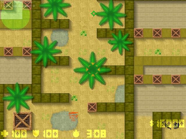
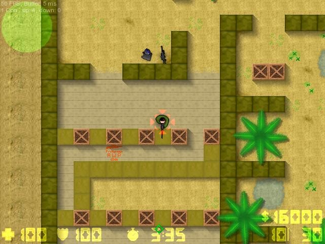
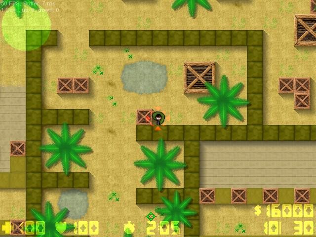
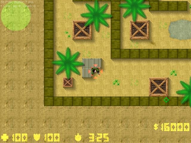
The map is symmetrical, so you can be sure it's balanced and fair.
It's quite a simple map; no sprites, cs2d_normal tileset, etc.
The four breakable walls are probably the most complicated aspect of the map.
But who knows - it might just be genius in its simplicity


Approved by GeoB99
 Download
2 kb, 772 Downloads

 1
1 


